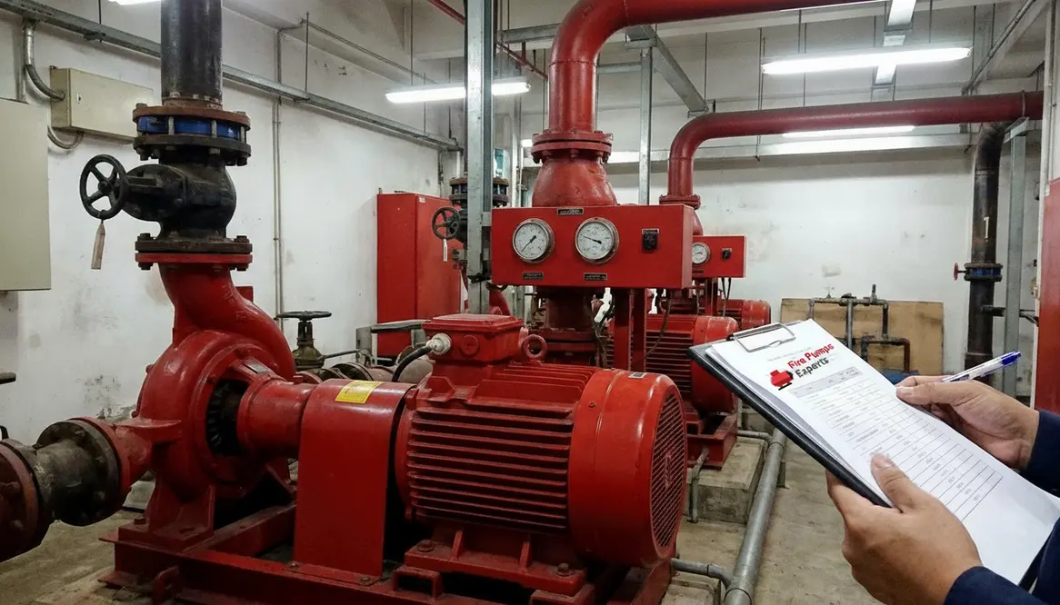
Fire Pump Curve Guide and Performance Charts
Reading a fire pump curve is less about squinting at a line on a chart and more about understanding how your fire pump will behave when the heat is on. This guide keeps the technical backbone but tells the story in plain language for real-world facilities.
Understanding Fire Pump Curves and Performance Charts
When I look at a fire pump curve, I see more than a graph. I see the story of how a pump will behave when a fire protection system needs it most. That matters because commercial and industrial buildings do not get second chances when water demand rises fast. So, if you manage a warehouse, plant, tower, or major property, these charts help me judge whether the pump can deliver pressure, flow, and reliability without drama. And yes, a pump curve can feel a little like a movie plot twist, except this one decides whether your sprinkler system gets its hero moment.
What a fire pump curve tells me
A fire pump curve shows the relationship between flow and pressure. In simple terms, when flow goes up, pressure usually goes down. That tradeoff is normal, and I use it to understand the pump’s real performance, not the sales pitch version. The curve lets me see the pump’s best operating range, shutoff pressure, and where it starts to lose efficiency. In a commercial fire system, that information helps me match the pump to the building demand instead of guessing and hoping for the best. Hope is great for birthday candles. Not so much for fire protection.
How I read the main parts of the chart
The chart usually includes several key points that guide my review. First, I check the rated point, which shows the flow and pressure the pump is built to deliver. Next, I look at shutoff pressure, which is the pressure at zero flow. Then I review churn or no flow operation, because the pump still has to behave well when demand is low. Finally, I watch the curve shape itself. A smooth curve gives me more confidence than one that looks like it was drawn during a caffeine emergency.
The four essentials I pull from every chart
Flow tells me how much water the pump moves.
Pressure tells me how hard the pump pushes that water.
Efficiency tells me how well the pump uses power while doing the job.
Power demand tells me how much energy the motor or driver needs at different points on the curve.
Why performance charts matter for commercial facilities
In commercial and industrial properties, I cannot treat the fire pump as a generic machine. A high rise, data center, manufacturing site, or distribution hub can each have very different water needs. That is why performance charts matter. They help me compare the pump’s output to the actual system demand, including sprinklers, standpipes, hose allowances, and elevation loss. They also help me spot trouble before it becomes expensive, such as a pump that looks fine on paper but falls short under real conditions. In this business, “close enough” is a phrase that belongs in cookbooks, not fire protection.
Dual column view: what I check and why it matters
What I check
- Rated flow and pressure
- Curve shape
- Shutoff pressure
- Efficiency range
- Power curve
Why it matters
- Confirms the pump meets the design point
- Shows how stable the pump will be across demand changes
- Helps me avoid overpressure problems
- Reduces wasted energy and heat
- Prevents motor overload at high flow
How I compare the curve to real system demand
After I review the chart, I compare it to the building’s hydraulic need. That means I look at the water supply, pipe friction, elevation, and device demand together. If the system needs more pressure at peak demand than the pump can provide, the curve will show the gap right away. On the other hand, if the pump produces too much pressure at low flow, I may need to address control issues or system stress. I also watch where the actual demand sits on the curve most of the time, because a pump that lives far from its best point can wear out faster.
For deeper technical guidance, I recommend checking a trusted fire pump curve guide for commercial fire protection systems. It is one of the better ways to see how a fire pump curve translates from theory to the kind of real buildings that actually catch fire.
Common mistakes I see on pump charts
One mistake I see often is treating the curve like a one point answer. It is not. A fire pump works across a range, so I need the full picture.
Another mistake is ignoring the power curve. If the driver cannot handle the load, the system may fail at the exact moment it should shine.
I also see people skip field conditions. A curve from the catalog does not know about dirty strainers, old piping, valve settings, or the reality of a busy industrial site. The chart gives me the map, but the building still writes some of the route.
FAQ
Conclusion
If I want a fire protection system to perform with confidence, I do not guess, and I do not wing it like a sitcom subplot. I use the fire pump curve to verify flow, pressure, and operating range for the building’s real demand. If you manage a commercial or industrial facility, now is the time to review your pump data, compare it to your system needs, and make sure the chart matches the mission. A quick check today can prevent a costly surprise tomorrow. Let’s make sure your pump is ready when it counts, and that every fire pump curve you rely on actually reflects how the system will behave in the moment that matters.